Usage
To start using the components in your project import the stylesheet in your css or html file.
You can also import individual components if you only need a few of them. The links to import individual components can be found in their respective pages.
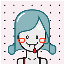
Avatar
Standard Avatar :
Image Avatar
The avatar component has 5 sizes, avatar-xl (4em), avatar-lg (3em), avatar-std (2em) avatar-sm (1.5em), and avatar-xs (1em).
Text Avatar
Alerts
Standard Alerts :
The alert component has four variants alert-success, alert-danger, alert-warning and alert-info.
Avatars with Badge :
.
.
.
Avatars support presence indicators. There are three indicators online, offline and dnd.
Icons With Badge
The badge component can be used with and without the badge count
Buttons
Solid Buttons
The solid button component is available in three variants btn-primary, btn-secondary and btn-danger.
Outline Buttons
The button component is available in three variants outline-primary-btn, outline-secondary-btn and outline-danger-btn.
Icon Buttons
Add the btn-icon class to the button element and a img tag with the link to the icon.
Link Buttons
Icon Buttons
Floating Action Button
It is the button which floats with the UI and represents the primary action in an application
Example : It is the + button on this page that is floating with scroll
Cards
Card with badges
Trending
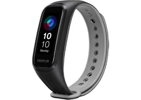
OnePlus Smart Band
13 Exercise Modes
Card with dismiss
Trending
X
OnePlus Smart Band
13 Exercise Modes
Card with Overlay
OnePlus Smart Band
13 Exercise Modes
Text Only Card
OnePlus Smart Band
13 Exercise Modes
Horizontal Card
OnePlus Smart Band
13 Exercise Modes
Shadow Card
Trending
OnePlus Smart Band
13 Exercise Modes
Images
Responsive Images
It is very important to use responsive images in our
To create responsive image you need to add image-responsive class to the element

Circular Image
To generate circular image you need to add image-circular class to the element.
Inputs
The input tag specifies an input field where the user can enter data. The input element is the most important form element. The input element can be displayed in several ways, depending on the type attribute like text, radio, checkbox etc.
You can also disabled them by using appropriate classes.
Input Field
This type of field will help you to get some information from user like name, email etc.
Input With Error Style
This error styling will help you to show instant response to user when you will add some validation to your form.
Please Enter Correct Email.
Radio Input Button
Radio buttons allow the user to select only one option from all given options. one thing keep in mind while using radio button the name attribute for each input must be same
Checkbox Input
Checkboxes allow the user to select one or more option from all given options.
Text Utilities
Heading
Our Component library has all headings from h1 to h6
H1 - Heading
H2 - Heading
H3 - Heading
H4 - Heading
H5 - Heading
H6 - Heading
Small Text ( Paragraph, Span )
Both Paragraph and Span has same font style. for paragraph you can use p tag and for span you can use span tag.
P - Paragraph
Span TagText Align
The Text align property specifies the horizontal alignment of text in an element.
we have different text alignments like text-left | text-center | text-right
This is text left example.
This is text center example.
This is text right example.
Lists
Lists are used in various places such as navigation bar, article page etc.
Example of Unordered Lists
We have 4 types of lists the default one than the list with circular bullets, list with square bullets and list with no bullets.
- Item1
- Item2
- Item3
- Item1
- Item2
- Item3
- Item1
- Item2
- Item3
- Item1
- Item2
- Item3
Example of Ordered Lists
We have 4 types of lists the default one than the list with circular bullets, list with square bullets and list with no bullets
- list Item1
- list Item2
- list Item3
- list Item1
- list Item2
- list Item3
- list Item1
- list Item2
- list Item3
- list Item1
- list Item2
- list Item3
- list Item1
- list Item2
- list Item3
- list Item1
- list Item2
- list Item3
Example of Inline Lists
- Inline List
- Inline List
- Inline List
Modal
Modals are pop-ups that are used to show important information to the user.
Modals are different from Dialog Box as the user can't continue work on site until user responds to the Modal.
While in case of Dialog Box, user can continue working on site without necessarily interacting with it.
Modal Example
Grid
Simplified Grid
Grids are used to guide the designers with how and where to place elements on the page.
We have multiple grid options in this library. you can use any of then depends on your sub-childs
Classes we provide - grid-2 | grid-3 | grid-4 | grid-5 | grid-6 | grid-responsive
Grid With Two Items
Grid With Three Items
Grid With Four Items
Grid With Five Items
Grid With Six Items
Grid With Responsiveness Items
Grid of 5 Items using template area property
Ratings
Rating components can be used as read-only badge or in reviews section. Can be used in reviews section as form too.
Range Slider
This component can be used by users to make selections from a range of values.
Toast
This component can be used for toast or snackbar component. Toast is mostly used to show feedback message. Snackbar is to used show message that need user action